“I am endeavouring to find that blush of light over light and the colour within the light; the depths through which we see when we look into and not at colour.”
—LEON BERKOWITZ
Colours rely on light; we literally can’t see them without a light source, which is why the vacuum of space looks like infinite darkness perforated with pinholes of starlight. Colours interact with light in two different ways: in one process, light reflects off something and reveals a colour; in the other, light is emitted from something and provides us with a colour. These two processes, respectively, are called reflection and emission.
Reflection v. emission
Imagine you’re sitting on the beach, reading a comic book. You can see the pages because the sun is shining on the page, allowing you to see the colourful pigments that have been printed there. This is an example of reflection. When you’re done reading the comic book, you pull your phone out and look at the LED screen, which lights up to reveal its own colourful icons. This is an example of emission.
Reflections can hinder emission and vice-versa. For example, you might find yourself trying to angle the screen of your phone so that the sunlight doesn’t reflect off it, or you might find that placing the light on your phone beneath the page of the comic book ruins your ability to see the colours on the page. Essentially, they cancel each other out: reflected light makes it harder to see emitted colours, and emitted light makes it harder to see reflected colours.
Colour models
Different rules apply when we mix colours depending on whether they’re being perceived through emission or reflection. Although it would make easy sense to call these processes reflective colour mixing and emissive colour mixing, they are instead called subtractive and additive colour – because physicists love to break things down into mathematical forms.
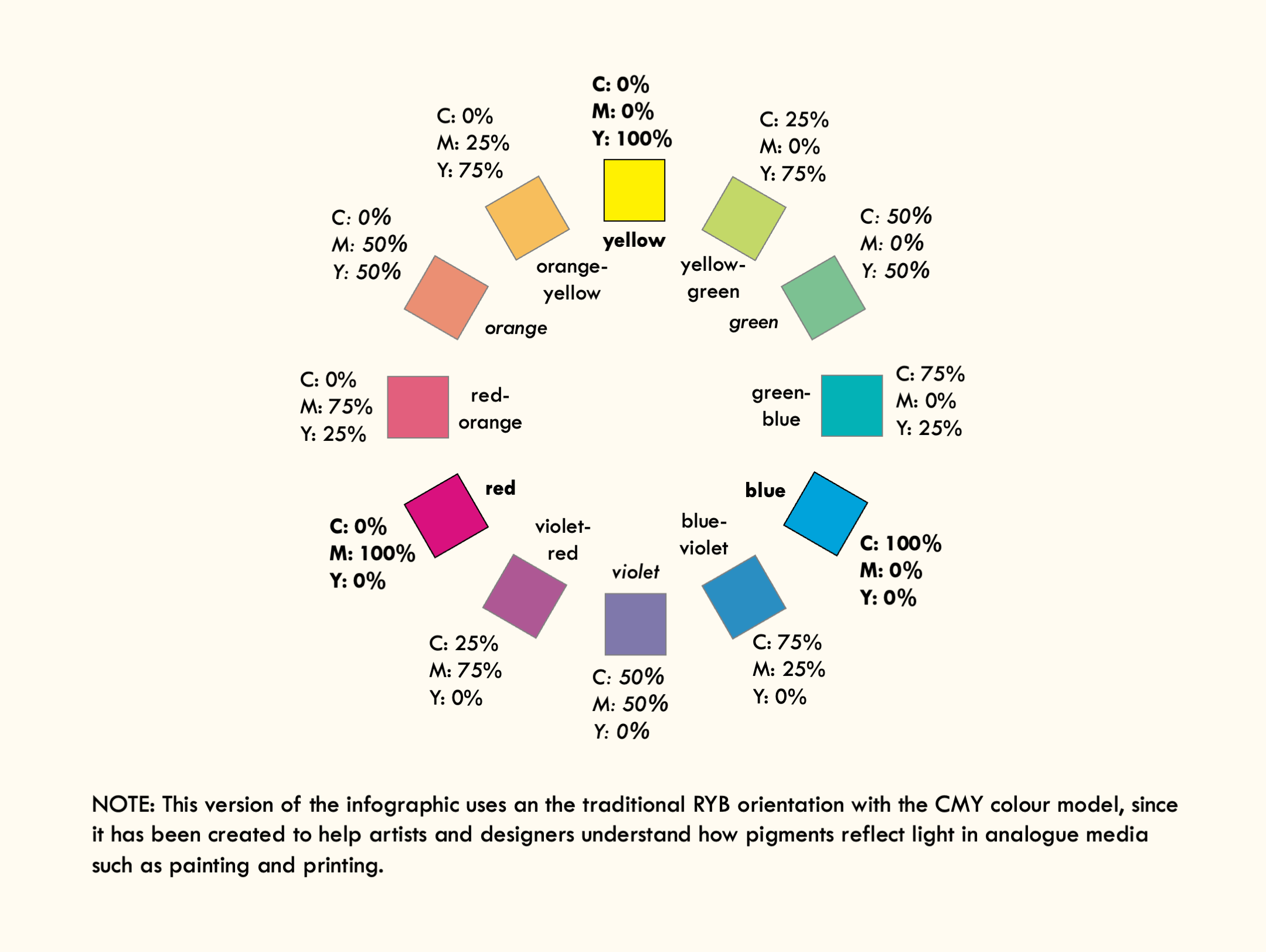
In subtractive colour mixing, pigments absorb light through reflection, and different hues are created by adding more pigment. In other words, the colour becomes visible by taking away (i.e. subtracting) light; think of it like a painter applying layers of oil colours until the white canvas below is no longer visible. This model is also known as the CMY colour, after cyan, magenta and yellow – the essential pigments that must be combined to produce other colours. A classic example of CMY colour would be an inkjet printer, which contains cartridges with each of these colours; any hue that we see printed on paper is simply produced by layering these three colours to different degrees.

© André Karwath, CC BY-SA 2.5
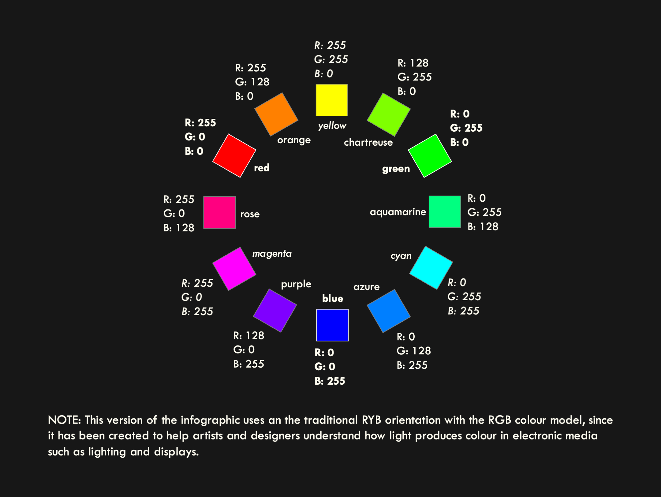
In additive colour mixing, different wavelengths are combined to create different hues, which become lighter and lighter until all you’re left with is white. In other words, it involves adding more light to create mixed colours. This model is often referred to as RGB colour, after the essential hues of red, green and blue, which are combined to produce other colours. A classic example of RGB colour can be seen if you sit extremely close to a television; the full image and mixed colours break down into tiny pixels, each containing red, green and blue sandwiched together. These three colours are then combined in different amounts to produce all the other hues in the spectrum.
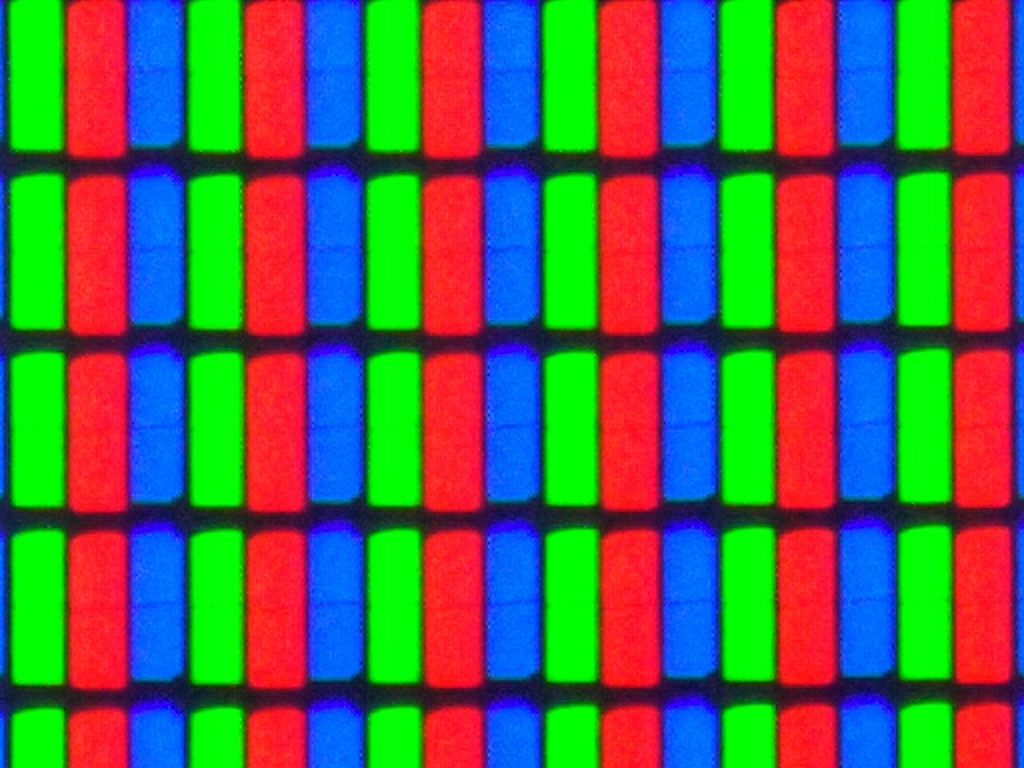
© Kuiperbharat, CC BY-SA 4.0
The traditional model is an ancestor of subtractive colour. It uses less precisely defined hues of red, yellow and blue, leading it to be dubbed the RYB model. This model existed before we had the modern scientific understanding of how light affects colour, so it is an outdated heuristic, since it is a ‘best guess’ approach that bears some similarity to CMY, but lacks the mathematical accuracy around how those colours are calibrated. Despite this, many people still find it useful to think in terms of the RYB colour wheel since this is how artists have approached colour theory for centuries.
Colour wheels
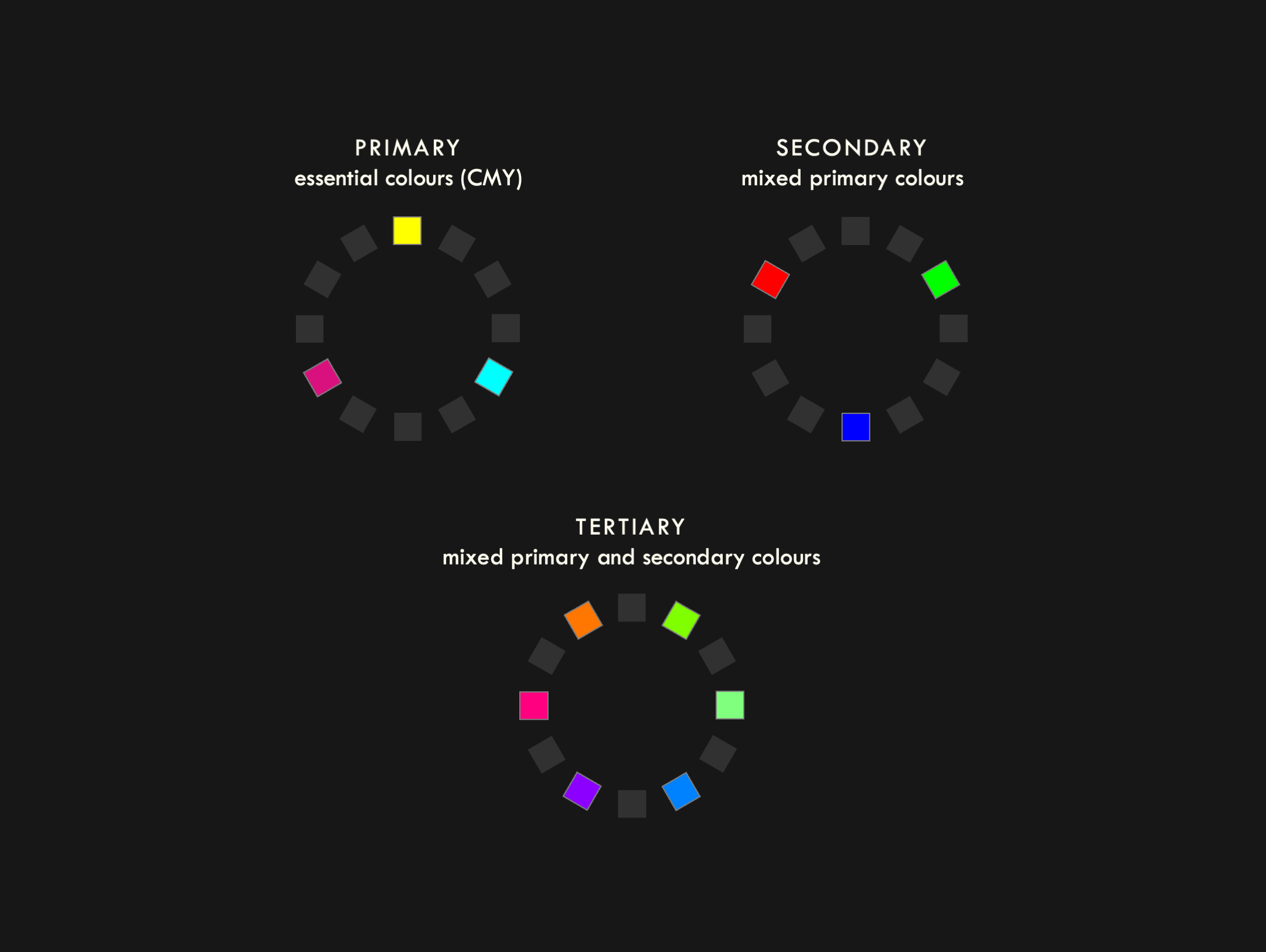
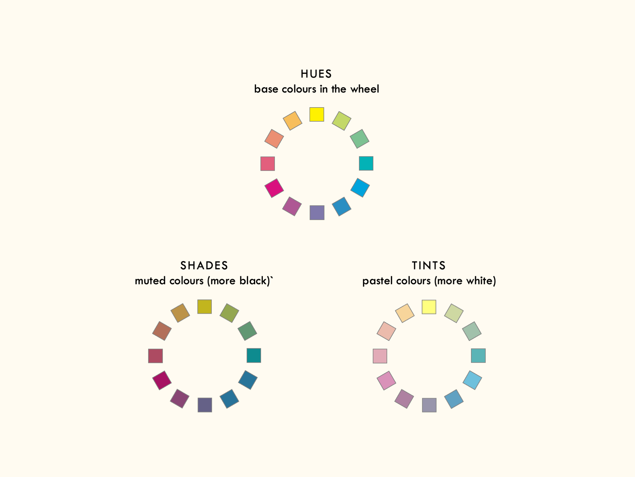
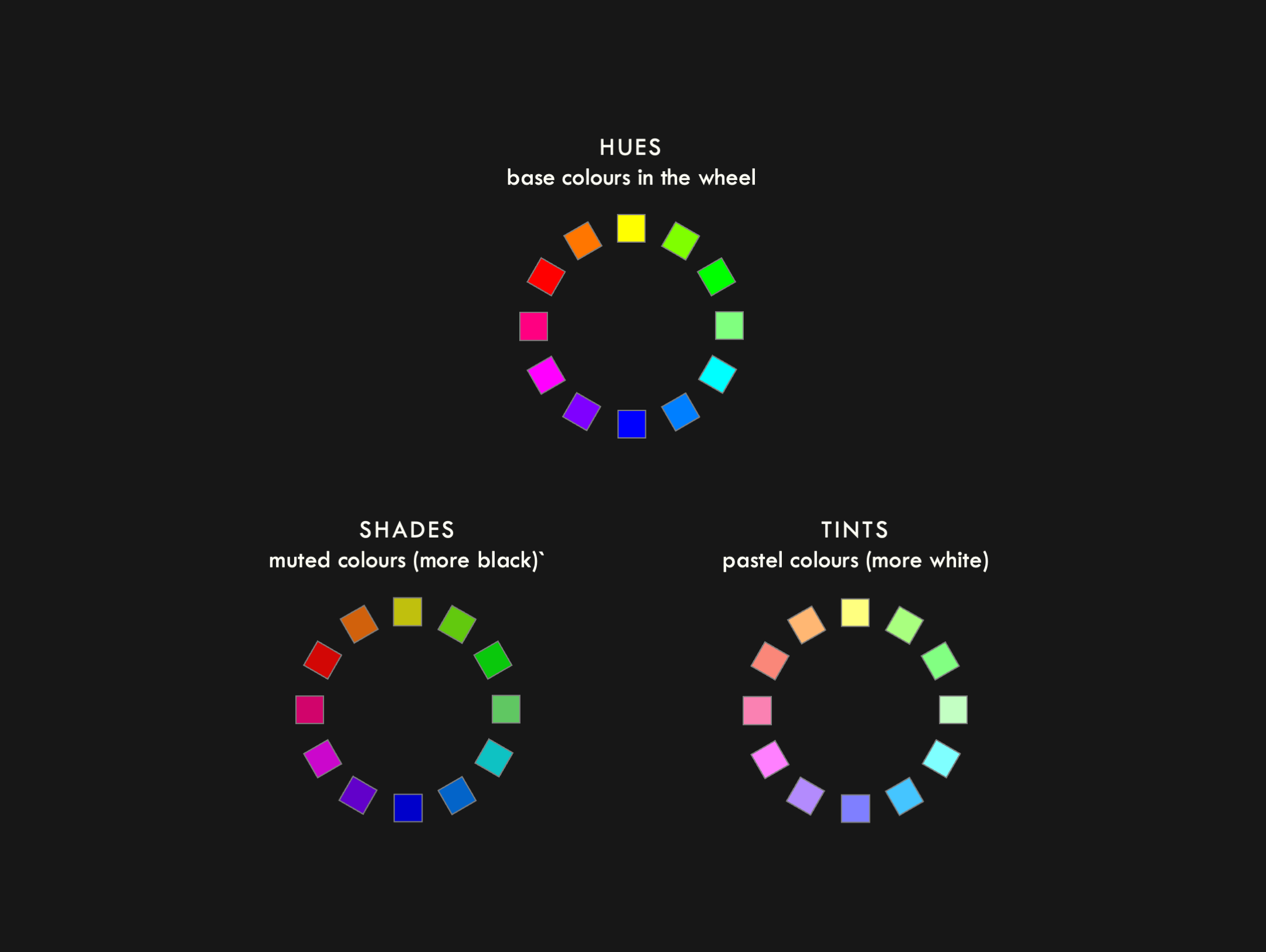
Since both colour mixing models are useful for different applications, the figures used throughout this page are providing in both CMY (with a cream background) and RGB (with a black background).
Essential colours
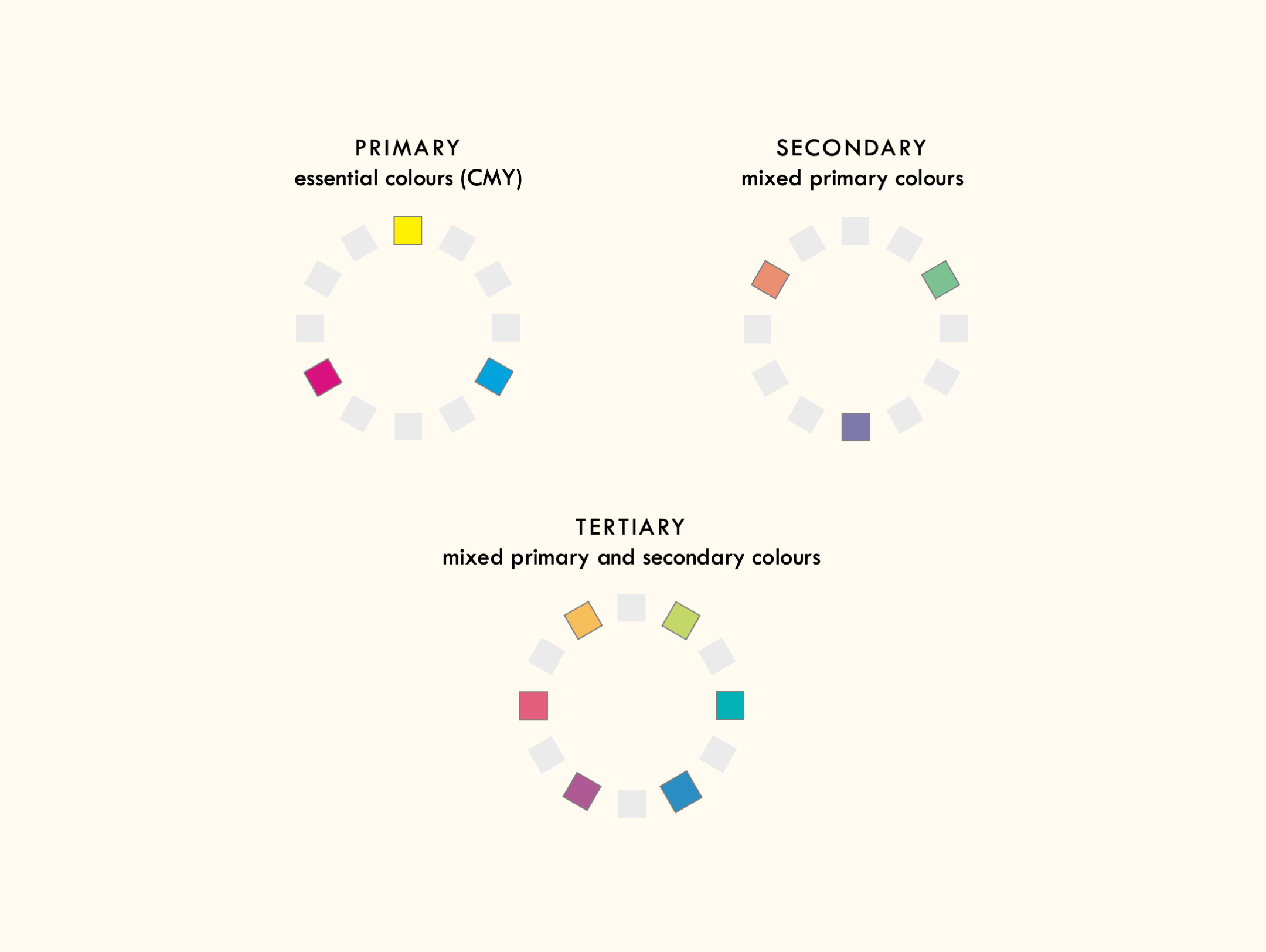
Both colour models feature a triad of essential colours: for the subtractive model, it’s cyan, magenta and yellow; for the additive model, it’s red, green and blue. These are known as primary colours. Most of you will have learnt about these when you were a child, so we culturally tend to associate them with simplicity and innocence (see the section on TRIADIC colour schemes for more on this).
Mixing these colours in pairs then creates a triad of secondary colours . In the subtractive model, these are orange, green and violet, while in the additive model, they are cyan, magenta and yellow. That’s right—just to confuse things even more, the RGB model contains the primary colours of the CMY model as its secondary colours. It’s important, however, not to assume that the subtractive colour wheel is just an inverted additive colour wheel. Again, it bears repeating that the difference doesn’t lie in the choice of colours, but in how they are perceived, since the subtractive model uses reflected light while the additive moves uses emitted light.
Hues, shades and tints
When colours are at their strongest level of chromatic intensity[efn_note]N.B. The academic term is colourfulness, but it’s so plain compared to the mathematical precision of ‘additive’ and ‘subtractive’ that it sounds made-up[/efn_note], they are called hues. These hues can be made darker in the subtractive model by adding other pigments, while in the additive model, they are made darker by reducing the luminosity. When they become darker, they are referred to as shades. On the other hand, the hues can be made lighter in the subtractive model by reducing the intensity of pigments, while in the additive model, they are made lighter by increasing the luminosity. These lighter variants are referred to as tints.
For a subtractive example, a person might dye a yellow shirt to a darker shade by combining magenta and cyan dyes, while they could make the yellow shirt lighter by soaking it in thinned bleach to weaken the colour. By comparison, a lighting tech might suggest that an actor wears white instead of black while the stage is bathed in blue light, since they want the audience to notice the colour.
Colour schemes
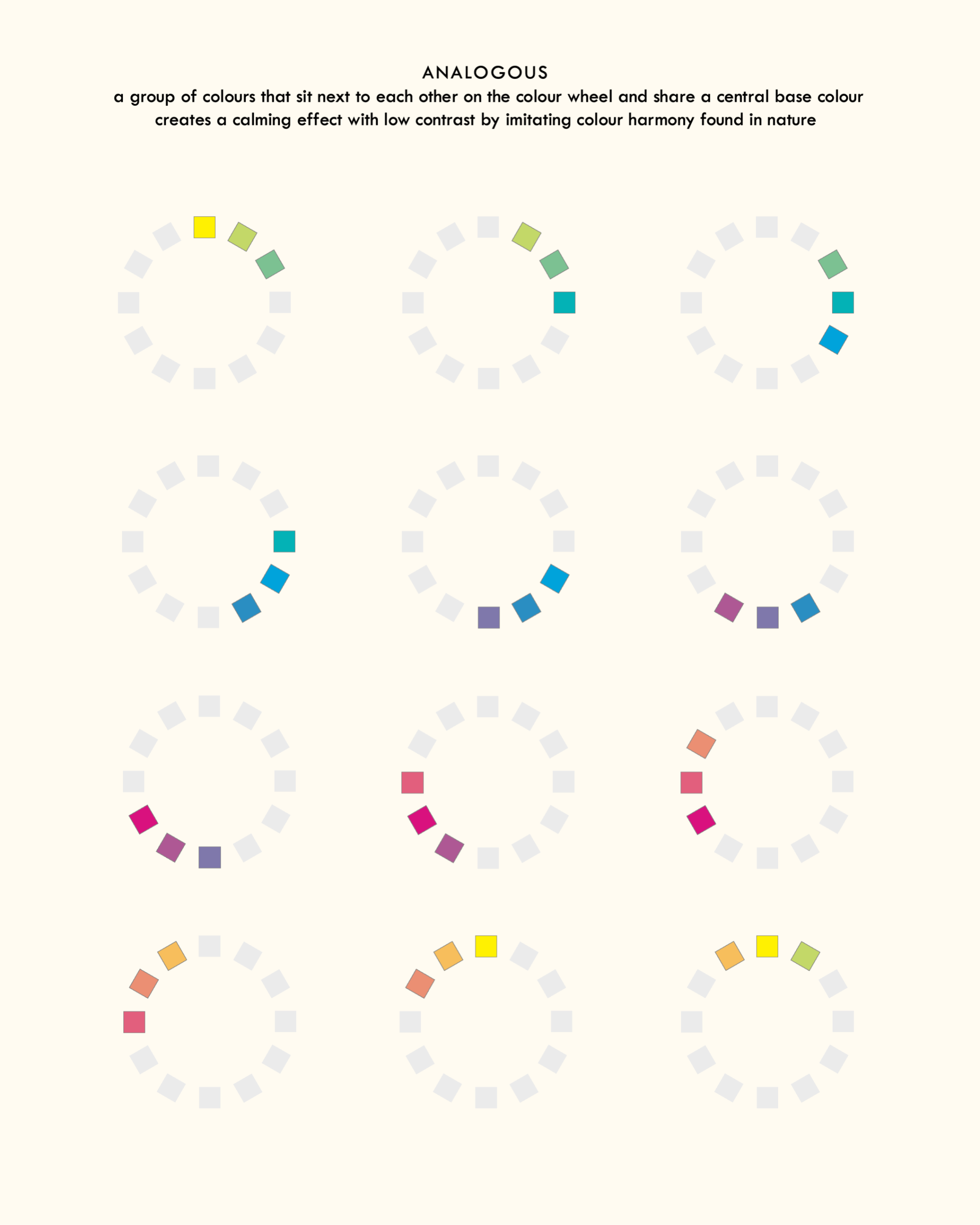
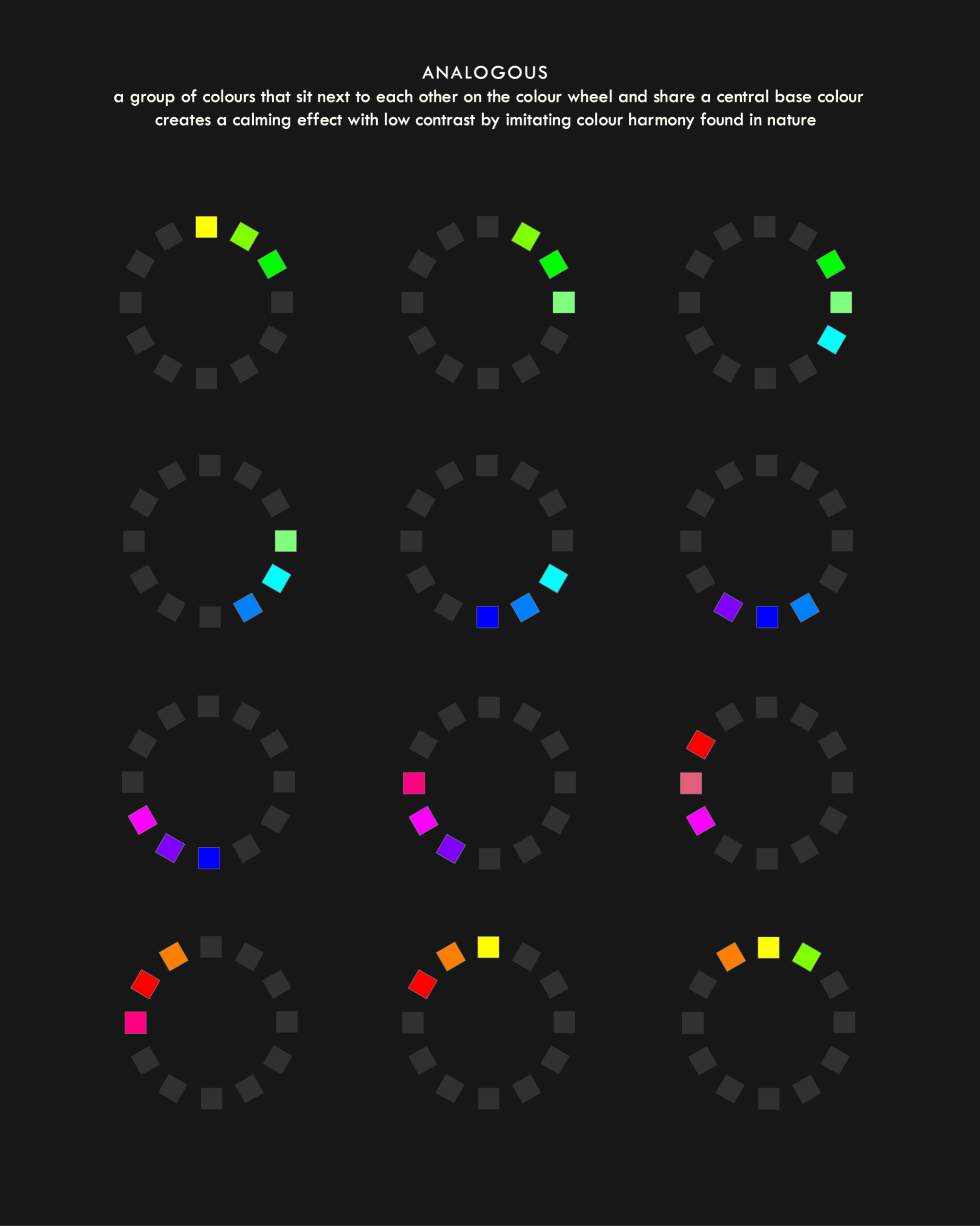
Analogous colours
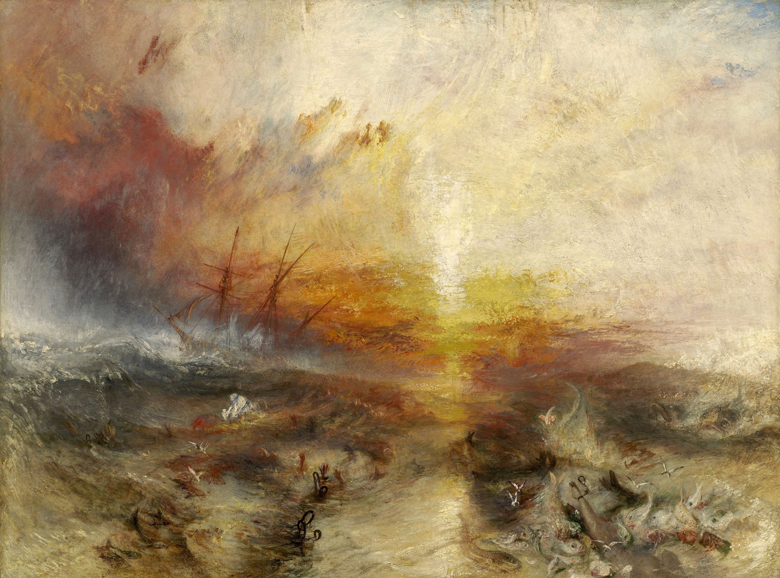
The Slave Ship (1840) by J. M. W. Turner
J. M. W. Turner’s The Slave Ship is a subtle example of analogous colour used to create a striking composition. The painting is based on the Zong massacre, where the crew of a British slave ship killed more than 130 enslaved African people in order to collect insurance money by throwing them into the ocean. Turner masterfully uses analogous tints and shades of red, orange and orange-yellow to create the sense that the sunset blazing across the choppy waters is like the mouth of hell, with the dark brown limbs of the people just barely poking out among the chop and surf of the waves. Outside of the main colour scheme, Turner makes small concessions to other hues in the small blush of grey-blue in the top-right corner—representing a calmness that has been destroyed by the chaos of the event—and the violent strokes of pale green-blue to the far left, depicting the power of the typhoon—a stark reminder that mankind’s false hierarchies are no match for the brutal power of nature.
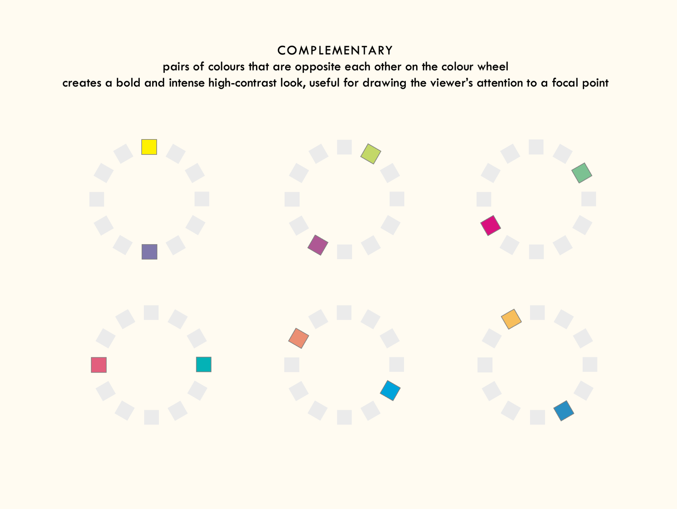
Complementary colours
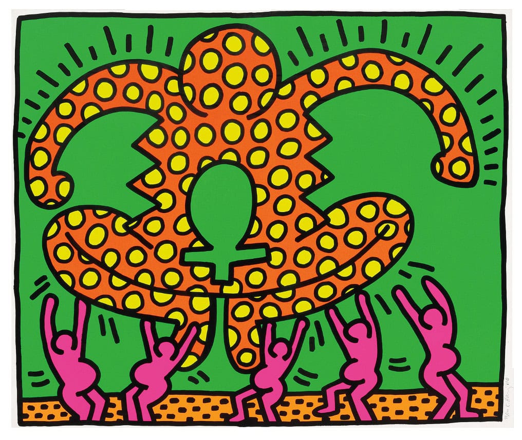
Painting #5 from Fertility Suite (1983) by Keith Haring
Throughout the five paintings that make up Fertility Suite, Keith Haring uses of the bold clash of complementary colours to draw the viewer’s eye to his depictions of the women of Sub-Saharan Africa, who at that time were experiencing the rapid rise of the AIDS epidemic largely due to negligence among nations in the Global North, perpetuated by racism and homophobia in media narratives around the illness. In this painting, Haring creates a sharp contrast between a bright green background and five pregnant women painted in a magenta hue to create a sense that the women are both part of their environment but also distinct in their own right. Meanwhile, an oversized figure towers above them, painted in more harmonious hues of yellow and red-orange, with an ankh sitting like a keyhole somewhere between its abdomen and loins. While it’s easy to assume the figure is a person, a closer look at the negative space of the background reveals two green hands holding the figure up by its arms, suggesting it is a young child or baby. With this in mind, we could read the yellow polka dots on its body as a representation of an inherited illness, in line with the Fertility Suite’s focus on the AIDS epidemic. Haring’s colours and patterns are clearly influenced by the vibrant Ankara print wrappers often worn by many African women, yet he avoid directly copying these patterns, instead adapting them to fit his own symbols and themes. Despite this dark subject matter, Haring’s choice of complementary colours and comic book-style motion lines (commonly called agitrons, after Mort Walker) suggests that there is an energy and vibrancy to the lives of these women.
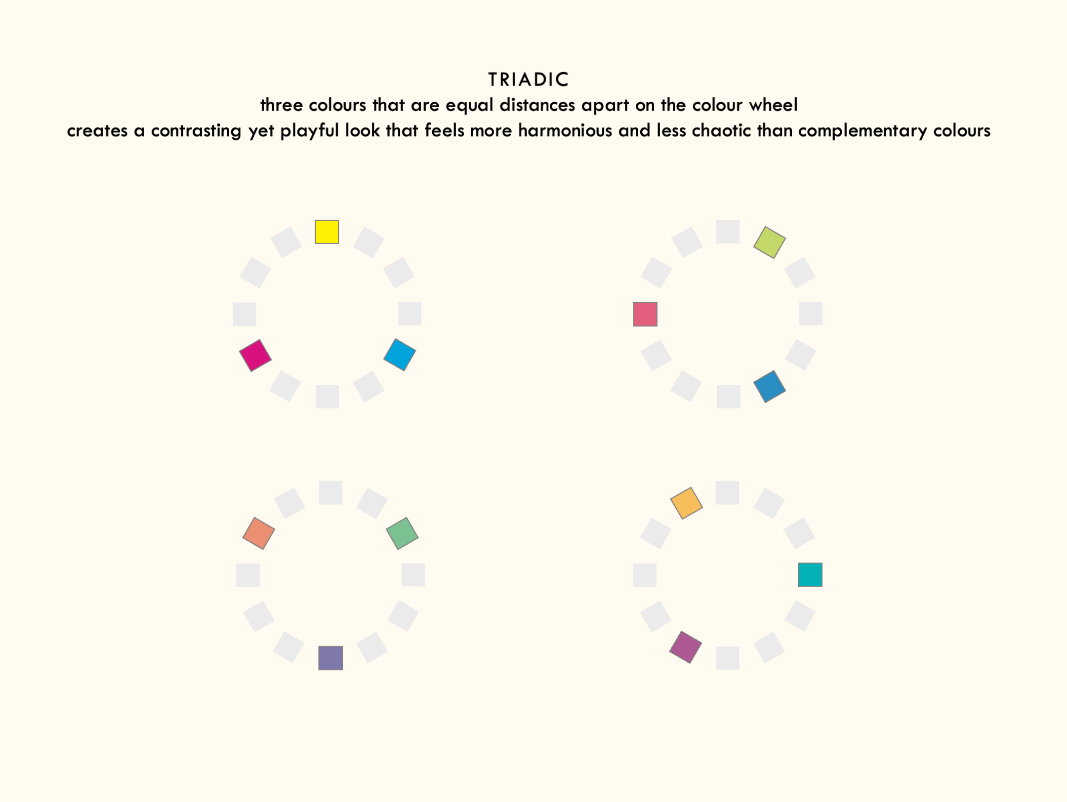
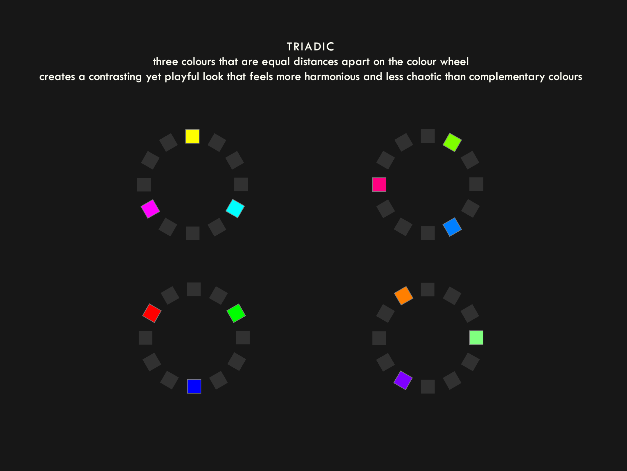
Triadic colours
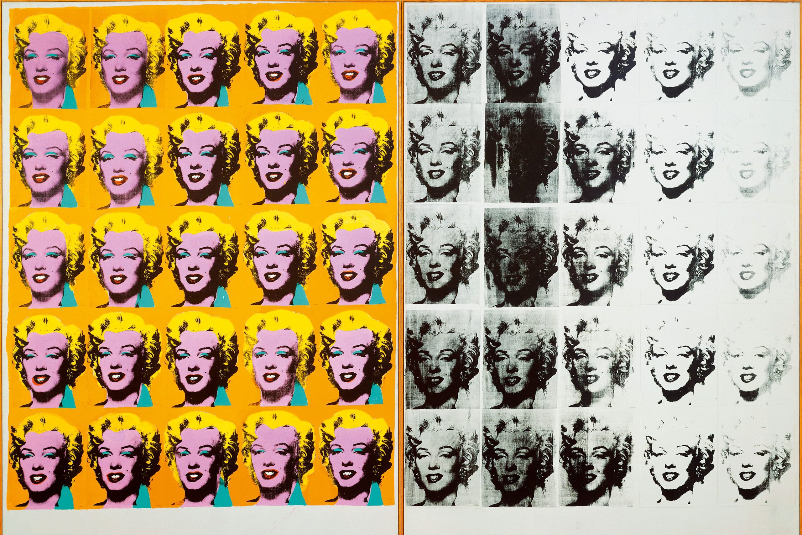
Marilyn Diptych (1962), by Andy Warhol
The 25 prints on the left side of Andy Warhol’s Marilyn Diptych famously recast a publicity photo of the actress Marilyn Monroe in lurid triadic hues of green-blue, violet-red and orange-yellow, with her hair being coloured using the neighbouring yellow. Warhol’s colours are playful – they feel both as if they clash and are yet somehow harmonious, a bit like a child scribbling with crayons in a colouring book or trying on make-up and achieving something unexpectedly aesthetically pleasing. The triadic hues also provide a stark contrast to the right side of the work, which features 25 corresponding prints of Marilyn Monroe that in various states of distortion and degradation. It’s worth noting that Monroe died from an overdose of barbiturates a few weeks before Warhol completed the work; its diptych structure suggests an interplay between childlike naivety and adult suffering, or between the artificial beauty of a public façade, represented by the uniform triadic colours, and the hidden ugliness of a fractured mind state, represented by the degrading black-and-white prints.
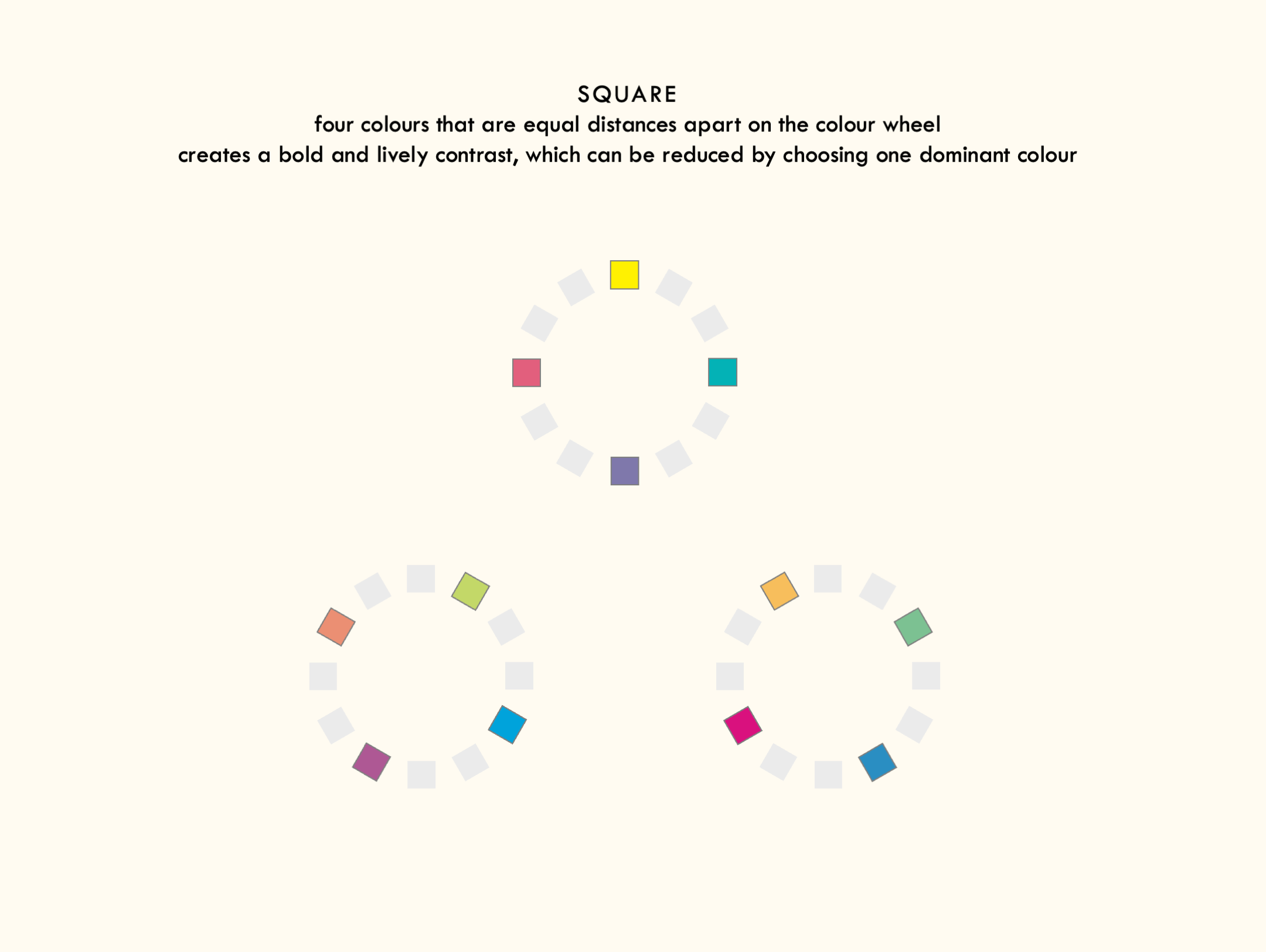
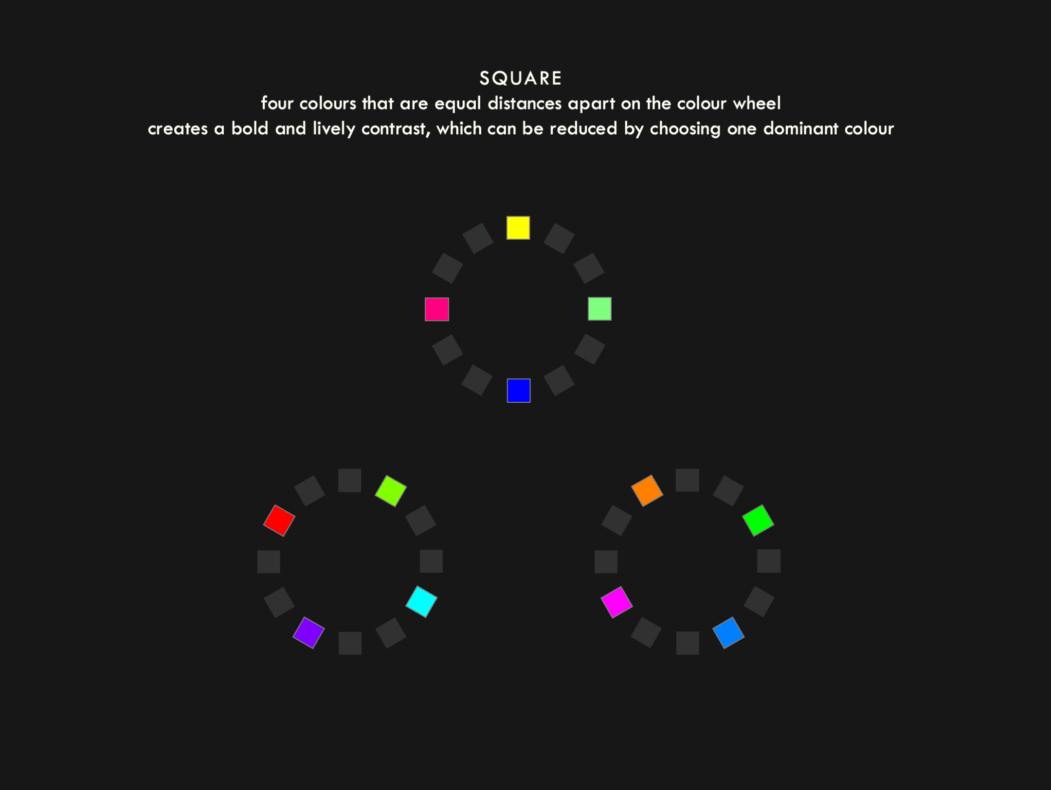
Square colours
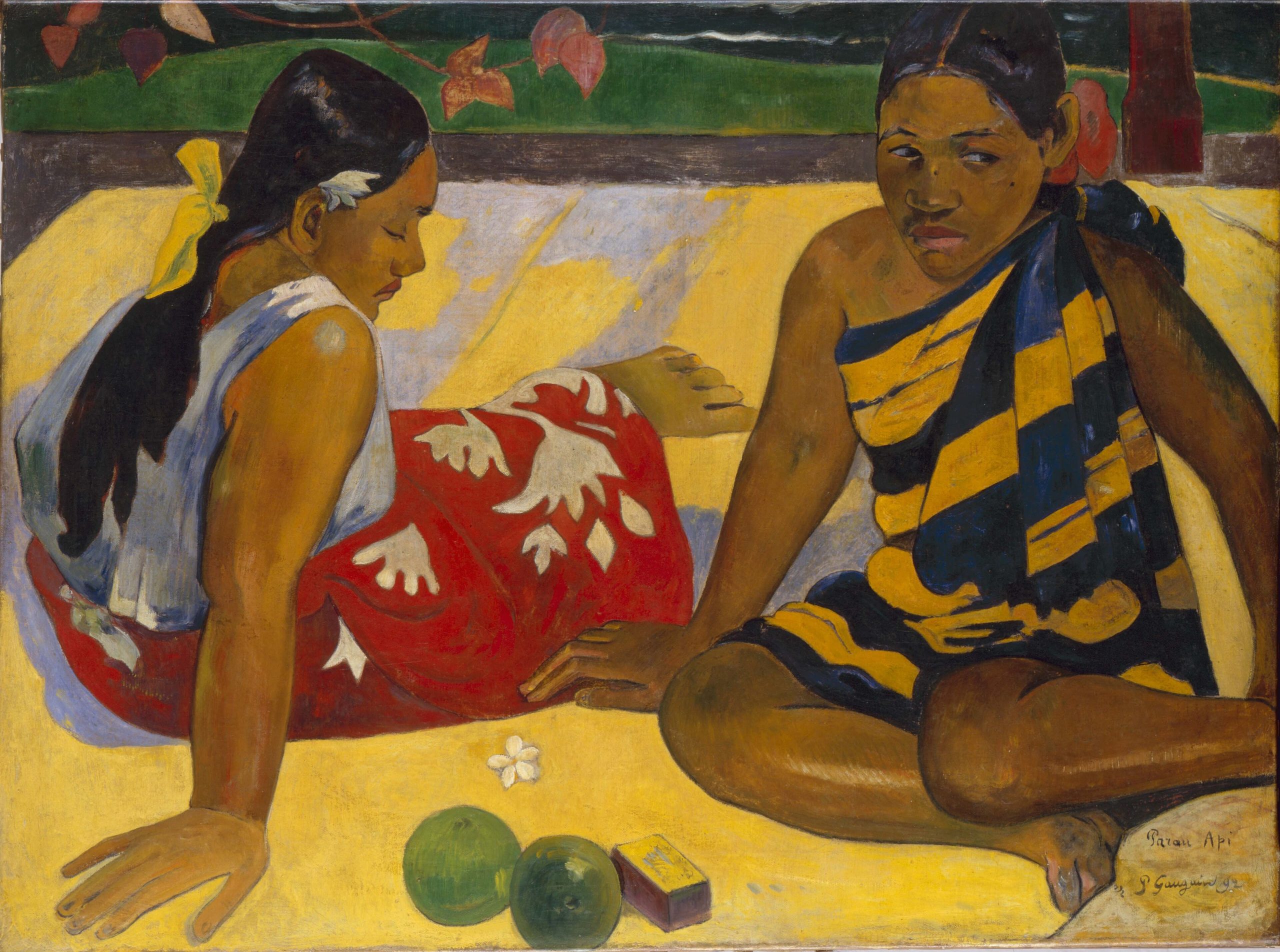
Parau Api (What News) (1892) by Paul Gauguin
Paul Gauguin’s Parau Api (What News) draws on a square colour scheme, with the red skirt of the woman on the left providing a vibrant contrast to the yellow of the blanket beneath them, the green of the background and the fruit, and the muted blues used to depict the shadows and folds in their clothes. The scene is bright and beautiful, but also slightly unsettling. For this reason, it’s interesting to note that the painting is a variant of an earlier painting Femmes de Tahiti, which features a more muted colour scheme, replacing the yellow with ochre and the navy and yellow dress of the woman on the right with a less harmonious violet-red nightdress.
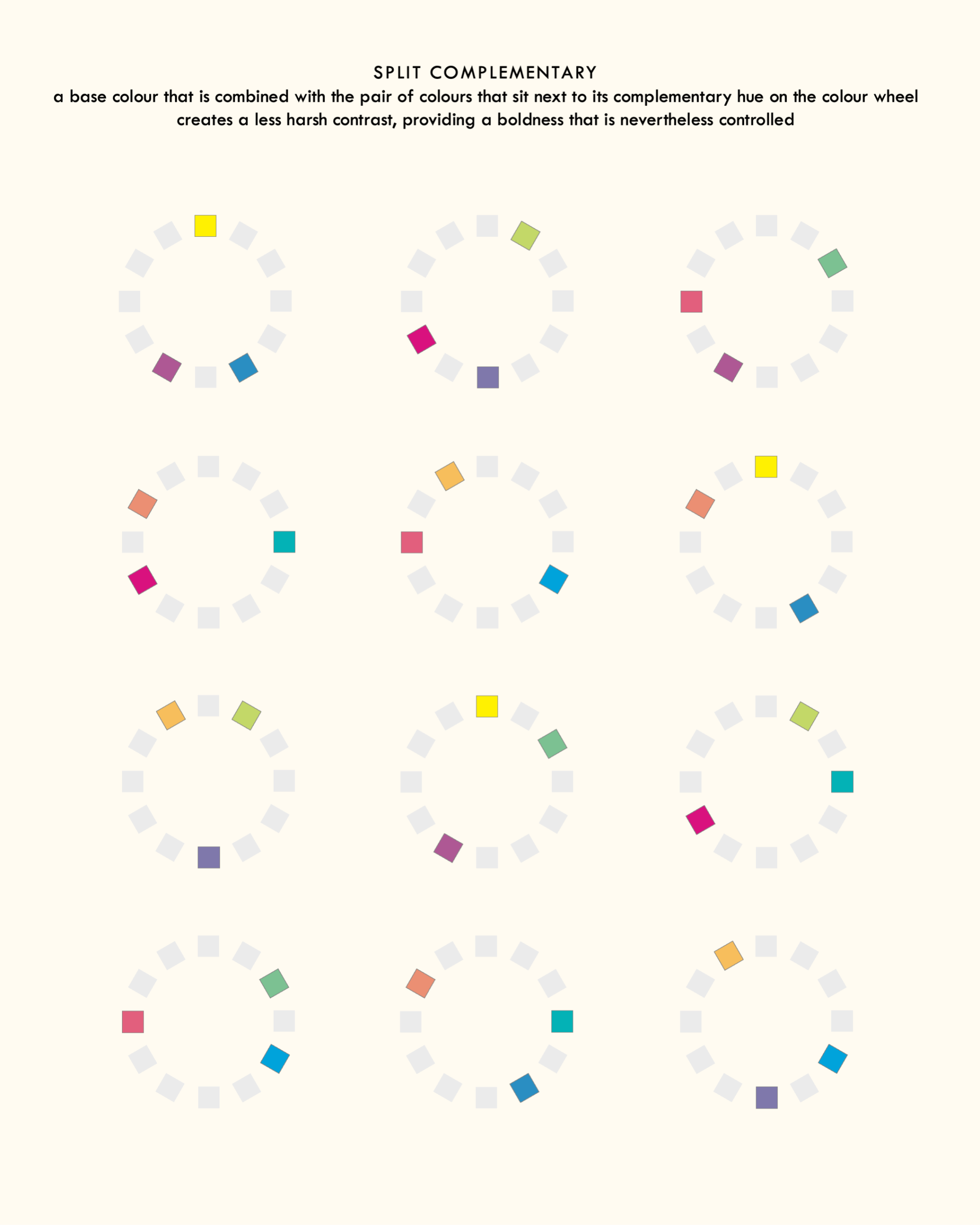
Split complementary colours
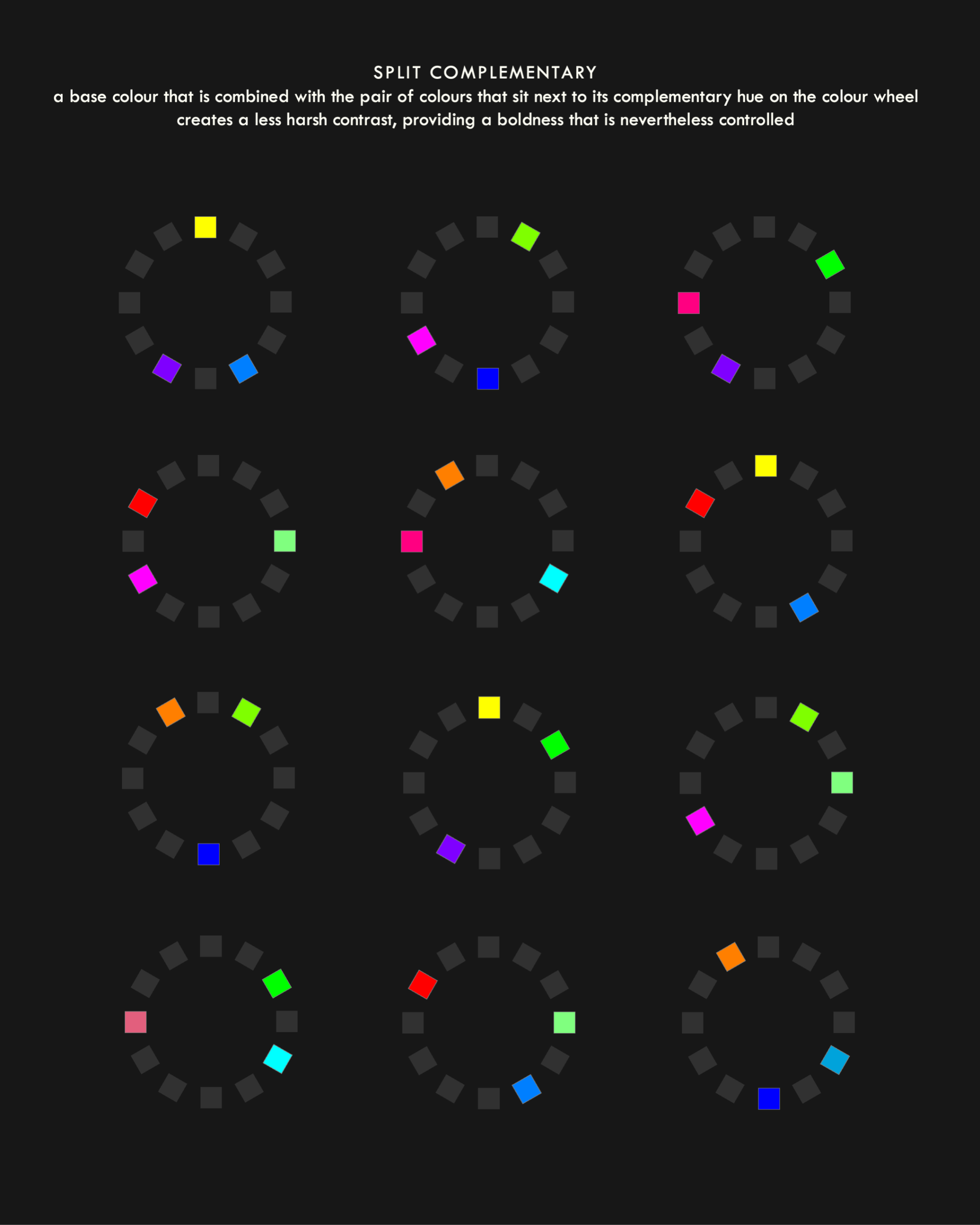
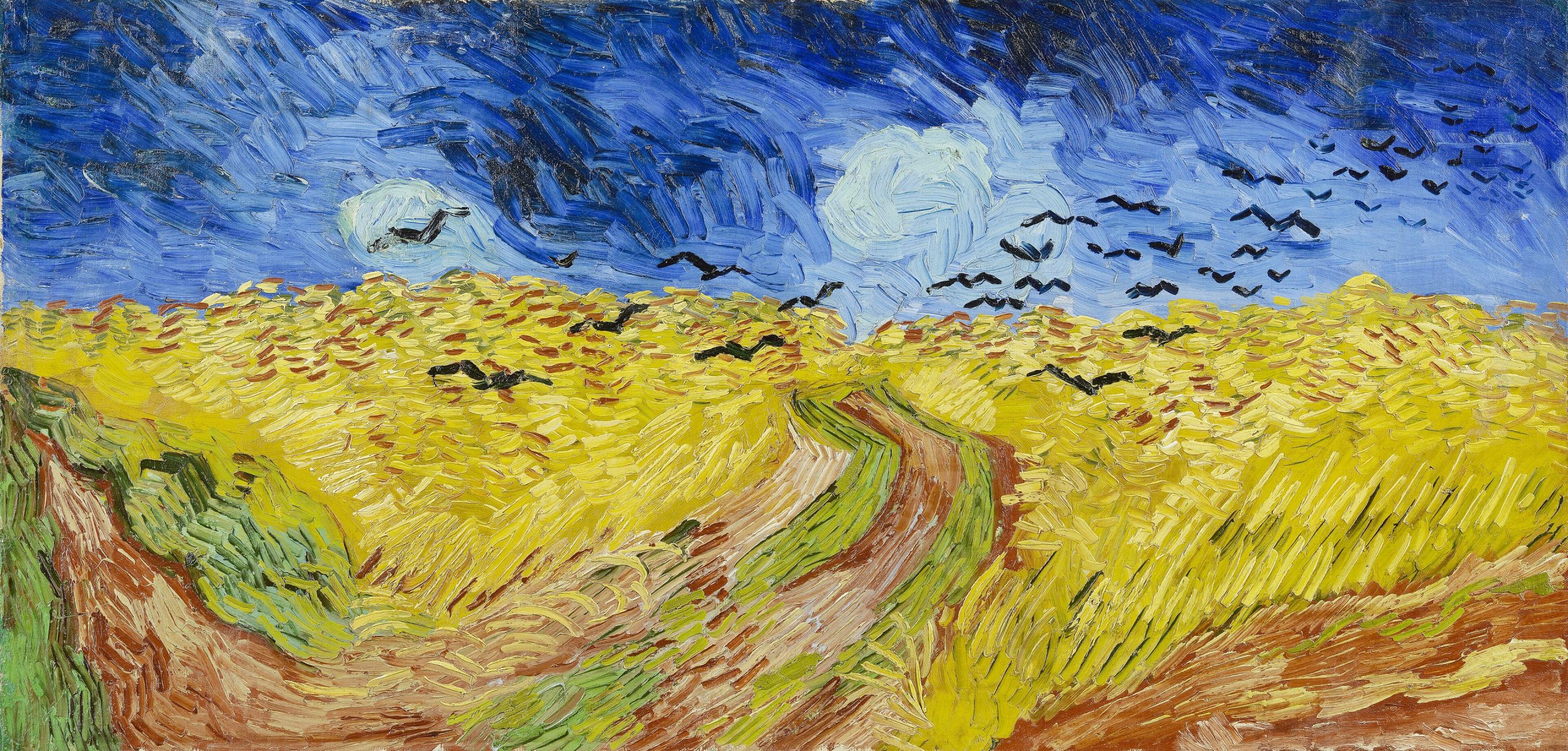
Wheatfield with Crows (1890) by Vincent Van Gogh
Vincent Van Gogh’s Wheatfield with Crows primarily relies on a split complementary colour scheme of yellow and orange against a rich shade of blue-violet to create the feeling of an oppressive sky being pulled over the restless and anxious energy of the field below. The artist uses some strokes of analogous green and yellow-green, so that the grass maintains harmony with the wheatfield rather than drawing attention away from the sky and the stark black of the crows.
Rectangular colours
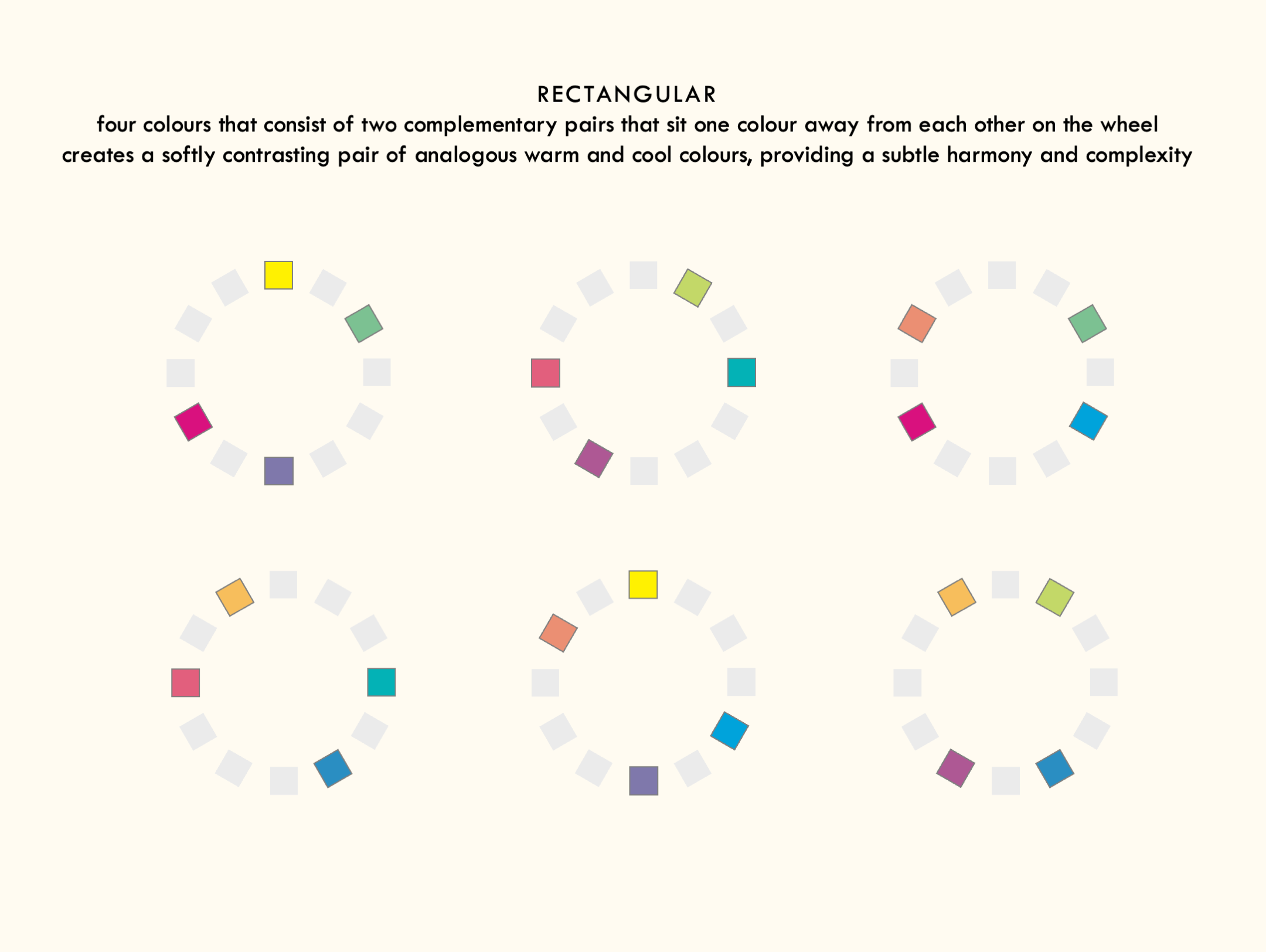
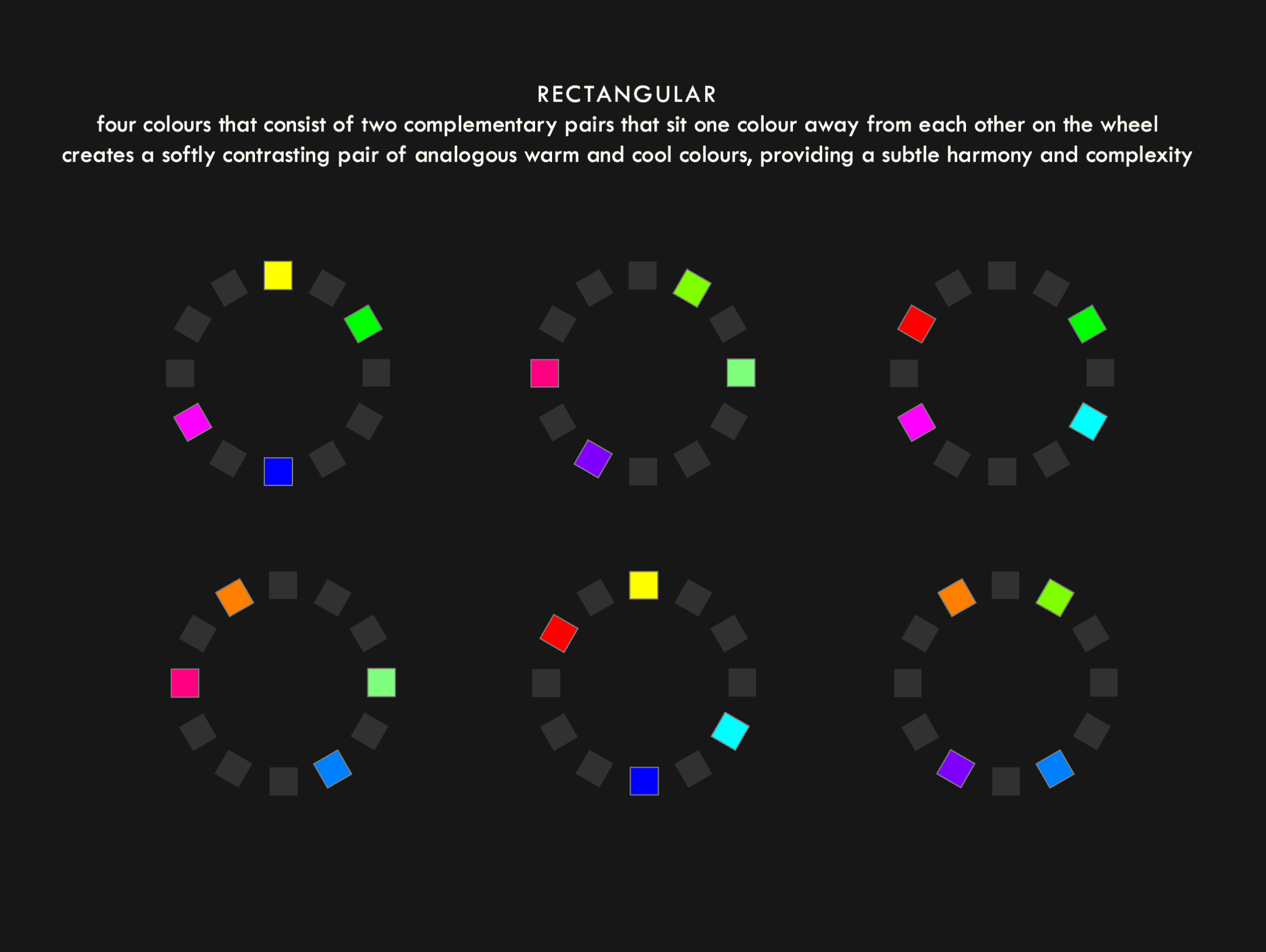
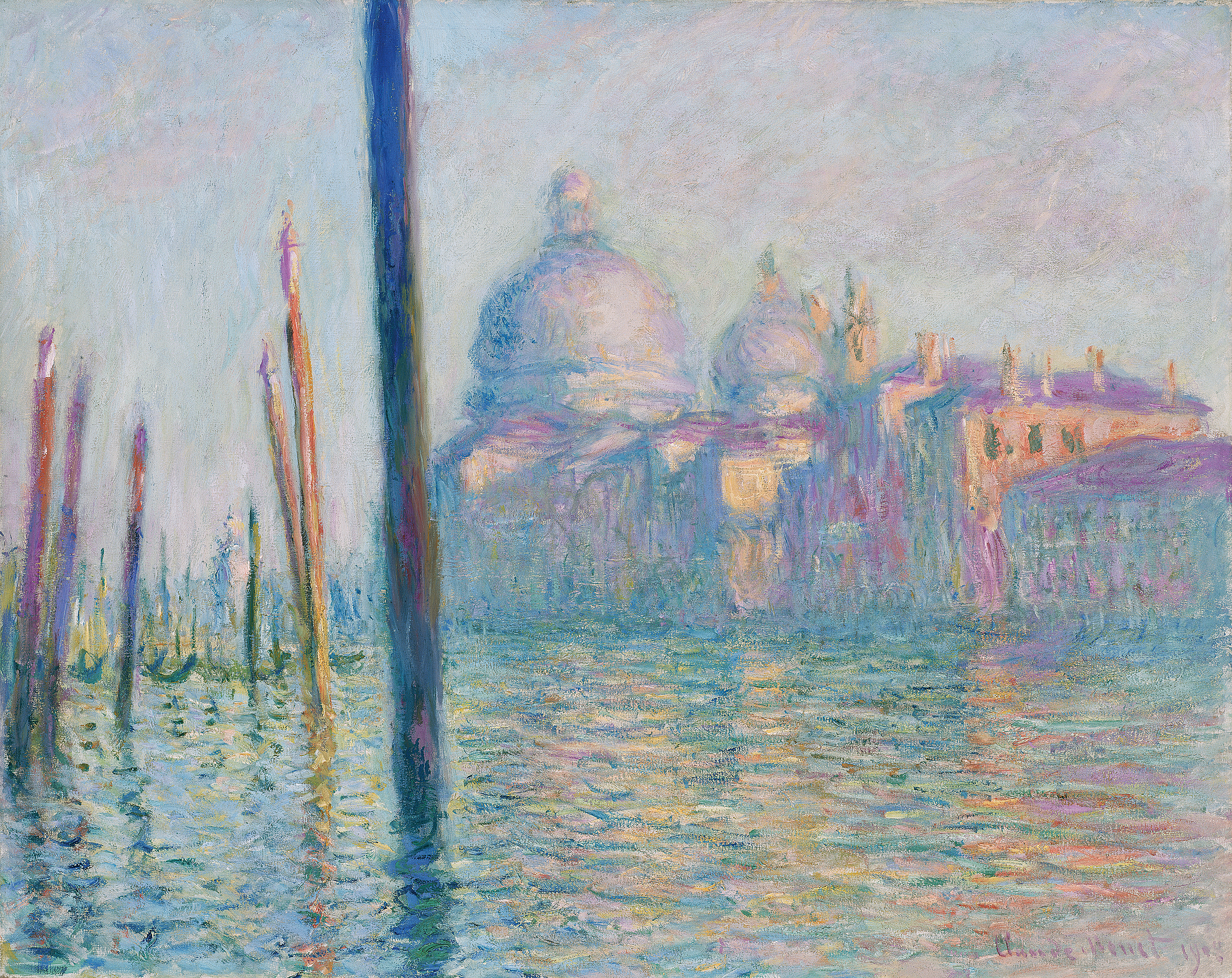
Le Grand Canal (1908) by Claude Monet
Claude Monet’s Le Grand Canal uses a rectangular colour scheme, balancing tints of cool blue and violet with warm orange and yellow to show the beauty of the sun setting against the light façade of the building. The artist layers these dual complementary colours in rough strokes to create a sense of movement on the water, but the closeness of the pairs provides a calm, harmonious aspect that would otherwise be missing if he used the harsher contrast of a square colour scheme.
Afterword
Although this page seems fairly exhaustive, it actually only covers the basics of how colour theory works. I haven’t even touched on things like monochrome shades and tints, the concepts of warmth and coolness within colour temperature, the use of colour spaces for graphic design, the cultural symbolism of colour (particularly in politics), hex codes for web colours, afterimages, the electromagnetic spectrum, and, last but not least, the viral phenomenon that was the dress. If I get time, I’ll add these things to that page. But for now, I’m sure the above items will be enough in the event that you find yourself looking for a quick guide while creating something that uses colour.
If you’d like a handy one-page version of all this information, you can find it in the infographic below. Like everything else on this page, it comes in two variants to depict the differences between the subtractive and additive models.